Brand rules
Begin with the reader’s home purchase question and useful value, then apply Hola CasaClara’s voice, naming, identity assets and source standards.
 Character
Bold
System built V0.1
Character
Bold
System built V0.1
Character
Bold
System built V0.1
Character
Bold
System built V0.1
A modular source of truth for brand, UI, tokens, components, and AI-guided production
Let's goTemplate / overview
In progress. This page arrives in a later version of the Hola CasaClara style guide.
In progress.
In progress.
In progress.
In progress.
In progress.
In progress.
In progress.
In progress.
In progress.
In progress.
In progress.
In progress.
In progress.
In progress.
In progress.
In progress.
In progress.
In progress.
In progress.
In progress.
In progress.
In progress.
In progress.
System / get started
Start here before adding a new brand, component, layout, token set, or AI rule. This page explains the operating model and links to the pages that hold the detailed rules.
The template rule stays fixed. The brand rule changes per client and per page. Every decision must connect to an approved source before it becomes a component, token, layout, or AI-ready instruction.
Begin with the reader’s home purchase question and useful value, then apply Hola CasaClara’s voice, naming, identity assets and source standards.
Document one approved component with anatomy, variants, states, tokens, accessibility, source, and copyable implementation.
AI selects from the approved system. It should never invent tokens, grids, layouts, components, states, or off-brand claims.
Follow this order when turning a new brand into a working guide. Do not start by styling components before the brand and token layers are defined.
| Step | Go to | What to define | Output |
|---|---|---|---|
| 1 | Brand | Positioning, audience, voice, promise, principles, claims. | Brand rule. |
| 2 | Assets | Logos, imagery, icons, source files, exports, usage limits. | Source library. |
| 3 | Foundations | Colours, typography, shapes, spacing, surfaces, feedback. | Foundation tokens. |
| 4 | Components | Anatomy, variants, states, tokens, accessibility. | Component rules. |
| 5 | Patterns | Navigation, layouts, templates, budgets, responsive rules. | Page recipes. |
| 6 | Systems | Tokens, AI contract, QA prompts, health gates, handoff notes. | Build-ready system. |
How each discipline navigates and applies the Hola CasaClara style guide.
Start with Brand foundation, Typography, and Colours. Document master components in Figma with exact token bindings, states, and responsive variants before handoff.
Export tokens via the build engine, consume CSS custom properties, implement semantic components, and verify WCAG AA accessibility across viewports.
Use Hola CasaClara’s voice to explain useful value, respect the person’s pace and make home purchase questions more understandable.
Load the AI usage contract and prompt templates. Assemble pages strictly from approved components, tokens, and layouts without inventing rogue tokens.
Foundations / brand foundation
Understand Hola CasaClara’s purpose, audiences and voice, then create consistent communications that help people explore and assess a home purchase calmly.
The purpose, audiences and role behind a clearer decision.
Hola CasaClara helps people explore and plan home purchases through calm explanations of mortgage options, initial costs and possibilities.
People planning a home purchase and renters exploring whether buying could fit their circumstances and plans.
Understand what buying could involve, then choose your next step with clearer information about costs and possibilities.
Write with warmth, composure, clarity and candour.
Adapt tone while keeping the person’s question central.
Rules that make consequential home decisions approachable and understandable.
Help people understand what a purchase could involve, starting with their question and explaining payments, upfront costs and changing conditions where they affect answers.
Give explanations a visible basis through relevant sources, dates and assumptions, keeping estimates distinct from lender decisions.
Respect the person’s circumstances and pace, offering useful explanations even when buying does not fit now, without pressure, invented reassurance or promises of bank approval.
Expressions preserving useful value, accuracy and personal choice.
| Topic | Do (Preferred expression) | Don’t (Prohibited drift) |
|---|---|---|
| Home purchase exploration | Explore possible payments and initial costs to assess your purchase plans. | We guarantee the best mortgage for every buyer. |
| Estimate limits | Use this estimate to explore options while confirming terms with lenders. | You are approved for this mortgage. |
| Commercial relationships | Explain relevant referral relationships and disclose applicable fees. | Everyone should buy instead of continuing renting. |
Foundations / typography
Use text styles when designing in Figma, and typography tokens in code. Momo Trust Sans carries headlines and the brand. DM Sans carries body and interface text.
The type system separates functional UI from expressive brand moments. AI and engineers should preserve this split before choosing size, weight, or hierarchy.
Primary product typeface for UI, forms, buttons, navigation, body copy, and component labels.
Display typeface for headlines, the cover title and brand moments.
  --sm-primitive-font-sans: "DM Sans", sans-serif;
  --sm-primitive-font-mono: ui-monospace, SFMono-Regular, "SF Mono", Menlo, Consolas, monospace;
  --sm-primitive-font-display: "Momo Trust Sans", sans-serif;
--sm-primitive-font-body: "DM Sans", sans-serif;@font-face {
font-family: "Momo Trust Sans";
src: url("../assets/fonts/MomoTrustSans.woff2") format("woff2-variations");
font-weight: 200 800;
font-style: normal;
font-display: swap;
}
@font-face {
font-family: "DM Sans";
src: url("../assets/fonts/DMSans.woff2") format("woff2-variations");
font-weight: 100 1000;
font-style: normal;
font-display: swap;
}
@font-face {
font-family: "DM Sans";
src: url("../assets/fonts/DMSans-Italic.woff2") format("woff2-variations");
font-weight: 100 1000;
font-style: italic;
font-display: swap;
}SIL OPEN FONT LICENSE Version 1.1 - 26 February 2007
Momo Trust Sans and DM Sans are licensed under the SIL Open Font License (OFL).Each Figma text style maps to a code token and a clear usage rule.
| Figma text style | Token | Usage |
|---|---|---|
| Display | ||
| Display / Page title | font.display | Momo Trust Sans 64 / 98% / 700. Cover titles and page openers. |
| Heading | ||
| Heading / XXL | font.heading.xxlarge | Momo Trust Sans 32 / 36 / 600. Page titles inside the documentation. |
| Heading / XL | font.heading.xlarge | Momo Trust Sans 28 / 32 / 600. Major section titles. |
| Heading / L | font.heading.large | Momo Trust Sans 24 / 28 / 600. Section titles and module headers. |
| Heading / M | font.heading.medium | Momo Trust Sans 20 / 24 / 600. Panel and card titles. |
| Heading / S | font.heading.small | Momo Trust Sans 16 / 20 / 600. Subsection and dialog titles. |
| Heading / XS | font.heading.xsmall | Momo Trust Sans 14 / 20 / 600. Card headings and field group titles. |
| Heading / XXS | font.heading.xxsmall | Momo Trust Sans 12 / 16 / 600. Eyebrows, overlines and small group labels. |
| Body | ||
| Body / L | font.body.large | DM Sans 16 / 24 / 400. Lead paragraphs and introductions. |
| Body / M | font.body | DM Sans 14 / 20 / 400. Default body text for documentation and interfaces. |
| Body / S | font.body.small | DM Sans 12 / 16 / 400. Captions, helper text and metadata. |
| Label and code | ||
| Label | font.label | DM Sans 14 / 20 / 500. Buttons, form labels, tabs and navigation items. |
| Code | font.code | ui-monospace 14 / 20 / 400. Token names, code snippets and values. |
  --sm-font-display: 700 64px/0.98 "Momo Trust Sans", sans-serif;
  --sm-font-display-cover: 400 64px/0.98 "Momo Trust Sans", sans-serif;
  --sm-font-heading-xxlarge: 600 32px/36px "Momo Trust Sans", sans-serif;
  --sm-font-heading-xlarge: 600 28px/32px "Momo Trust Sans", sans-serif;
  --sm-font-heading-large: 600 24px/28px "Momo Trust Sans", sans-serif;
  --sm-font-heading-medium: 600 20px/24px "Momo Trust Sans", sans-serif;
  --sm-font-heading-small: 600 16px/20px "Momo Trust Sans", sans-serif;
  --sm-font-heading-xsmall: 600 14px/20px "Momo Trust Sans", sans-serif;
  --sm-font-heading-xxsmall: 600 12px/16px "Momo Trust Sans", sans-serif;
  --sm-font-body: 400 14px/20px "DM Sans", sans-serif;
  --sm-font-body-large: 400 16px/24px "DM Sans", sans-serif;
  --sm-font-body-small: 400 12px/16px "DM Sans", sans-serif;
  --sm-font-label: 500 14px/20px "DM Sans", sans-serif;
--sm-font-code: 400 14px/20px ui-monospace, SFMono-Regular, Menlo, Consolas, monospace;System rules for pairing font weights, managing reading line lengths, and guaranteeing WCAG compliance.
Maintain consistent typographic proportion across documentation surfaces:
Typography rules to satisfy WCAG 2.1 Level AA:
Foundations / colours
The colour system defines how the brand reads on every screen and keeps surfaces, text and actions consistent by giving each value a semantic role.
Raw palette families, named by colour family and step. Components never call these directly; they reach them through semantic tokens.
  --sm-primitive-color-neutral-0: #FFFFFF;
  --sm-primitive-color-neutral-100: #F6F8ED;
  --sm-primitive-color-neutral-200: #F1EAD8;
  --sm-primitive-color-neutral-300: #D6C7B0;
  --sm-primitive-color-neutral-400: #A8A29E;
  --sm-primitive-color-neutral-500: #78716C;
  --sm-primitive-color-neutral-600: #57534E;
  --sm-primitive-color-neutral-700: #44403C;
  --sm-primitive-color-neutral-800: #454E4D;
  --sm-primitive-color-neutral-900: #2C3635;
  --sm-primitive-color-neutral-1000: #2A2A26;
  --sm-primitive-color-neutral-1100: #1C1917;
  --sm-primitive-color-neutral-1200: #000000;
  --sm-primitive-color-ink-400: #A8A29E;
  --sm-primitive-color-ink-600: #57534E;
  --sm-primitive-color-ink-800: #3A3A35;
  --sm-primitive-color-ink-900: #2A2A26;
  --sm-primitive-color-ink-1000: #2A2A26;
  --sm-primitive-color-surface-page: #F6F8ED;
  --sm-primitive-color-surface-line: rgba(42, 42, 38, 0.12);
  --sm-primitive-color-surface-code: #F1EAD8;
  --sm-primitive-color-accent-base: #485946;
  --sm-primitive-color-accent-surface: #F1EAD8;
  --sm-primitive-color-accent-focus-ring: rgba(72, 89, 70, 0.35);
  --sm-primitive-color-status-pass: #34C759;
  --sm-primitive-color-status-pass-text: #008430;
  --sm-primitive-color-status-warn: #FF8D28;
  --sm-primitive-color-status-warn-text: #BD5000;
  --sm-primitive-color-status-caution: #FFCC00;
  --sm-primitive-color-status-caution-text: #9B6600;
  --sm-primitive-color-status-red: #FF383C;
  --sm-primitive-color-status-red-text: #E0142B;
  --sm-primitive-color-status-info: #0088FF;
--sm-primitive-color-status-info-text: #1D6AEA;System feedback colours sit outside the brand families and stay consistent across every surface.
  --sm-color-feedback-pass: var(--sm-primitive-color-status-pass);
  --sm-color-feedback-pass-surface: #F3FCF5;
  --sm-color-feedback-pass-text: var(--sm-primitive-color-status-pass-text);
  --sm-color-feedback-warn: var(--sm-primitive-color-status-warn);
  --sm-color-feedback-warn-surface: #FFF8F2;
  --sm-color-feedback-warn-text: var(--sm-primitive-color-status-warn-text);
  --sm-color-feedback-caution: var(--sm-primitive-color-status-caution);
  --sm-color-feedback-caution-surface: #FFFCF0;
  --sm-color-feedback-caution-text: var(--sm-primitive-color-status-caution-text);
  --sm-color-feedback-red: var(--sm-primitive-color-status-red);
  --sm-color-feedback-red-surface: #FFF3F3;
  --sm-color-feedback-red-text: var(--sm-primitive-color-status-red-text);
  --sm-color-feedback-info: var(--sm-primitive-color-status-info);
  --sm-color-feedback-info-surface: #F0F8FF;
--sm-color-feedback-info-text: var(--sm-primitive-color-status-info-text);Intent-named tokens mapped to the primitive families. This is the layer components, developers, and AI build against.
| Token | Value | Role |
|---|---|---|
| color.accent | #485946 | Primary actions, links, selected states and the focus ring. |
| color.surface.sidebar | #485946 | Navigation sidebar, cover and other dark framing surfaces. |
| color.surface.page | #F6F8ED | Default page background. |
| color.text.primary | #2A2A26 | Primary text and high-contrast foreground. |
| color.text.secondary | #454E4D | Supporting text, captions, metadata and table labels. |
| color.border.default | rgba(42, 42, 38, 0.12) | Dividers, field outlines, table rules and card edges. |
| color.surface.fill | rgba(42, 42, 38, 0.04) | Quiet fills behind inputs, chips and hovered rows. |
| color.feedback.red | #FF383C | Errors, blocked actions, and red flag output. |
  --sm-color-surface-page: var(--sm-primitive-color-surface-page);
  --sm-color-surface-card: var(--sm-primitive-color-alpha-white78);
  --sm-color-surface-card-strong: var(--sm-primitive-color-alpha-white94);
  --sm-color-surface-control: var(--sm-primitive-color-alpha-white72);
  --sm-color-surface-fill: var(--sm-primitive-color-alpha-ink04);
  --sm-color-surface-code: var(--sm-primitive-color-surface-code);
  --sm-color-surface-raised: var(--sm-primitive-color-white);
  --sm-color-surface-sidebar: var(--sm-primitive-color-shell-surface);
  --sm-color-surface-sidebar-active: var(--sm-primitive-color-shell-active);
  --sm-color-surface-sidebar-highlight: var(--sm-primitive-color-shell-subactive);
  --sm-color-surface-gradient: var(--sm-primitive-color-alpha-white70);
  --sm-color-text-primary: var(--sm-primitive-color-neutral-1000);
  --sm-color-text-secondary: var(--sm-primitive-color-neutral-800);
  --sm-color-text-muted: var(--sm-primitive-color-ink-400);
  --sm-color-text-inverse: var(--sm-primitive-color-white);
  --sm-color-text-inverse-muted: var(--sm-primitive-color-alpha-white54);
  --sm-color-text-inverse-soft: var(--sm-primitive-color-alpha-white60);
  --sm-color-text-contrast-light: var(--sm-primitive-color-contrast-light);
  --sm-color-text-contrast-dark: var(--sm-primitive-color-contrast-dark);
  --sm-color-accent: var(--sm-primitive-color-accent-base);
  --sm-color-accent-surface: var(--sm-primitive-color-accent-surface);
  --sm-color-border-default: var(--sm-primitive-color-surface-line);
  --sm-color-border-separator: var(--sm-primitive-color-alpha-ink10);
  --sm-color-border-hover: var(--sm-primitive-color-alpha-ink16);
  --sm-color-border-inverse: var(--sm-primitive-color-alpha-white18);
  --sm-color-border-faint: var(--sm-primitive-color-alpha-black04);
  --sm-color-focus-ring: var(--sm-primitive-color-accent-focus-ring);
--sm-color-focus-ring-inverse: var(--sm-primitive-color-alpha-white24);Cards used only where the content earns one. The wide card carries the longer rule; the standard card holds a single guardrail.
Apply the semantic role to every fill and text colour and keep each screen ready for a new brand by never placing a raw hex value.
Text and icons meet WCAG AA against their surface: 4.5:1 for body text, 3:1 for large text and interface elements.
Casa Lime is a highlight and a fill on dark grounds. Never set text in Casa Lime on a light ground.
Contrast guarantees for the Hola CasaClara light theme, evaluated by the token engine.
Every semantic pairing is evaluated at build time by the automated AA gate in build/build.mjs:
Design token architecture for seamless Light and Dark reflow:
Foundations / shapes
In progress. This page arrives in a later version of the Hola CasaClara style guide.
In progress.
In progress.
In progress.
Foundations / tokens
Document primitive, semantic, and component tokens with code examples.
The design system organizes 467 tokens into four strictly governed architectural layers.
Representative sample of tokens and their role mapping in the Hola build.
| Token | Resolved Value | Category | Use |
|---|---|---|---|
--sm-color-accent | #485946 | Semantic | Brand accent, primary actions |
--sm-color-text-primary | #2A2A26 | Semantic | Main body and heading text |
--sm-color-feedback-red | #FF383C | Semantic | Error emphasis and danger buttons |
--sm-radius-sm | 4px | Primitive | Inputs, buttons, lozenges |
--sm-radius-md | 8px | Primitive | Cards, dialogs, popovers |
--sm-space-4 | 16px | Primitive | Base padding and gap step |
--sm-space-6 | 24px | Primitive | Container and section padding |
--sm-motion-duration-standard | 160ms | Primitive | Standard interaction transition |
--sm-motion-duration-quick | 140ms | Primitive | Rapid hover and focus transitions |
Screen reader text utility hiding content visually while keeping it accessible to assistive devices.
The .visually-hidden utility applies clip rect properties to hide decorative or redundant visuals without removing context from the accessibility tree.
:root {
  --sm-color-accent: var(--sm-primitive-color-accent-base);
  --sm-color-text-primary: var(--sm-primitive-color-neutral-1000);
  --sm-space-4: 16px;
  --sm-radius-md: 8px;
}

.card {
  padding: var(--sm-space-4);
  border-radius: var(--sm-radius-md);
  color: var(--sm-color-text-primary);
  background: var(--sm-color-surface-raised);
}
Assets / logos
Use visual-first asset blocks for logo variants, spacing, sizing, and usage rules. Never redraw, distort, or re-render canonical marks.
Approved brand mark configurations for product headers, editorial layouts, and icon representations.

<img src="assets/logos/hola-casa-clara-logo-primary.svg" alt="Hola Casa Clara Logo Primary (SVG)" />
<img src="assets/logos/hola-casa-clara-logo-primary.png" alt="Hola Casa Clara Logo Primary (PNG)" />
<img src="assets/logos/hola-logo-black.svg" alt="Hola Logo Black (SVG)" />
<img src="assets/logos/hola-logo-black.png" alt="Hola Logo Black (PNG)" />
<img src="assets/logos/hola-logo-white.svg" alt="Hola Logo White (SVG)" />
<img src="assets/logos/hola-logo-white.png" alt="Hola Logo White (PNG)" />
<img src="assets/logos/hola-initial-green.svg" alt="Hola Initial Green (SVG)" />
<img src="assets/logos/hola-initial-green.png" alt="Hola Initial Green (PNG)" />
<img src="assets/logos/hola-initial-lime.svg" alt="Hola Initial Lime (SVG)" />
<img src="assets/logos/hola-initial-lime.png" alt="Hola Initial Lime (PNG)" />
<img src="assets/logos/hola-avatar-1.svg" alt="Avatar 1 (SVG)" />
<img src="assets/logos/hola-avatar-1.png" alt="Avatar 1 (PNG)" />
<img src="assets/logos/hola-avatar-2.svg" alt="Avatar 2 (SVG)" />
<img src="assets/logos/hola-avatar-2.png" alt="Avatar 2 (PNG)" />
<img src="assets/logos/hola-avatar-3.svg" alt="Avatar 3 (SVG)" />
<img src="assets/logos/hola-avatar-3.png" alt="Avatar 3 (PNG)" />
<img src="assets/logos/hola-avatar-4.svg" alt="Avatar 4 (SVG)" />
<img src="assets/logos/hola-avatar-4.png" alt="Avatar 4 (PNG)" />
<img src="assets/logos/hola-favicon-1.png" alt="Favicon 1 (PNG)" />
<img src="assets/logos/hola-favicon-2.png" alt="Favicon 2 (PNG)" />
<img src="assets/logos/hola-favicon-3.png" alt="Favicon 3 (PNG)" />
<img src="assets/logos/hola-favicon-4.png" alt="Favicon 4 (PNG)" />In progress.
Strict constraints to prevent visual distortion or brand dilution.
| Violation | Constraint | Required Correction |
|---|---|---|
| Aspect distortion | Never stretch, compress, or scale the logo non-proportionally. | Lock the aspect ratio during scaling operations. |
| Unauthorized rotation | Never rotate the wordmark or symbol at an angle. | Always display marks horizontally on a 0 degree baseline. |
| Color drift | Never recolor the mark with non-system palette values. | Use only the supplied Hola CasaClara logo files, in their own colours. |
| Low contrast ground | Never place dark marks on dark backgrounds without sufficient contrast. | Ensure 4.5:1 contrast against surrounding background surface. |
Assets / image library
In progress. This page arrives in a later version of the Hola CasaClara style guide.
In progress.
In progress.
In progress.
In progress.
Assets / icons
Document the approved icon library, sizing, stroke rules, status usage, and accessibility labels.
Visual rules ensuring clarity, recognizable metaphors, and harmonious interface scaling.
Icons reduce visual clutter by communicating universal conceptual actions. Avoid overly intricate illustrations that blur at small sizes.
Standardize on 1.5px to 2px geometric strokes with rounded end caps and optical center weighting aligned to an active pixel grid.
Always bind icon strokes and fills to semantic tokens (such as color.icon.subtle or status tokens) rather than raw hardcoded fills.
Canonical vector marks and component symbols exported for application surfaces.


No icons match this search.
Standardized dimensions ensuring optical proportion across all touchpoints.
| Token | Dimension | Recommended Context | Preview |
|---|---|---|---|
| size.icon.100 | 16px | Compact inline text indicators, buttons, and chips. | |
| size.icon.200 | 18px | Table action triggers and compact toolbars. | |
| size.icon.300 | 20px | Standard form controls and input accessory slots. | |
| size.icon.400 | 24px | Navigation list items and section headers. |  |
| size.icon.500 | 32px | Featured card badges and tile icon emblems. | |
Rules governing screen reader announcement for iconographic content.
Icons accompanied by visible text labels must carry aria-hidden="true" to prevent redundant screen reader announcements (for example, Menu button or button with label).
Icons that function as interactive triggers without visible text must supply an accessible name via aria-label or an embedded <span class="visually-hidden"> element.
  --sm-size-icon-100: 16px;
  --sm-size-icon-200: 18px;
  --sm-size-icon-300: 20px;
  --sm-size-icon-400: 24px;
  --sm-size-icon-500: 32px;
Assets / source files
In progress. This page arrives in a later version of the Hola CasaClara style guide.
In progress.
In progress.
Components / buttons
In progress. This page arrives in a later version of the Hola CasaClara style guide.
In progress.
In progress.
In progress.
In progress.
In progress.
In progress.
In progress.
In progress.
In progress.
In progress.
In progress.
Components / fields
In progress. This page arrives in a later version of the Hola CasaClara style guide.
In progress.
In progress.
In progress.
In progress.
In progress.
In progress.
Components / controls
In progress. This page arrives in a later version of the Hola CasaClara style guide.
In progress.
In progress.
In progress.
In progress.
In progress.
In progress.
In progress.
Components / cards
In progress. This page arrives in a later version of the Hola CasaClara style guide.
In progress.
In progress.
In progress.
Components / feedback
In progress. This page arrives in a later version of the Hola CasaClara style guide.
In progress.
In progress.
In progress.
In progress.
In progress.
In progress.
In progress.
Components / data display
In progress. This page arrives in a later version of the Hola CasaClara style guide.
In progress.
In progress.
In progress.
In progress.
In progress.
Components / overlays
In progress. This page arrives in a later version of the Hola CasaClara style guide.
In progress.
In progress.
In progress.
In progress.
Patterns / layouts
In progress. This page arrives in a later version of the Hola CasaClara style guide.
In progress.
In progress.
In progress.
Patterns / templates
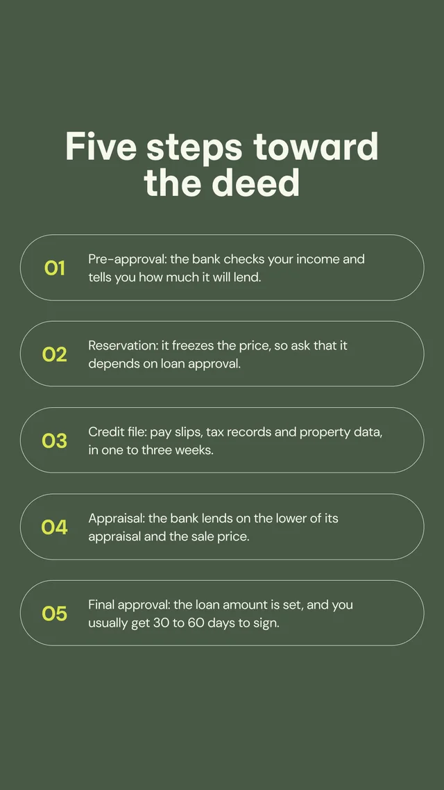
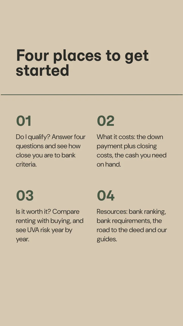
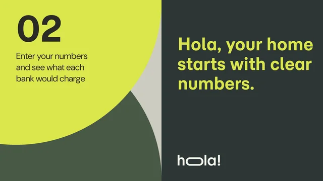
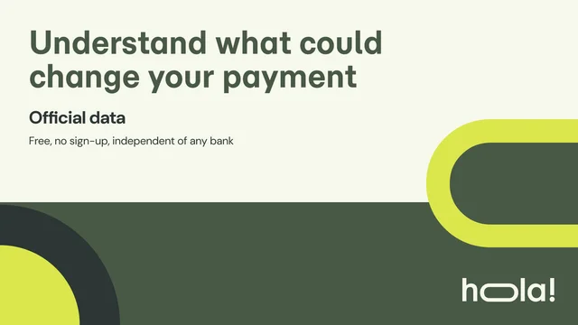
Document the approved page structures that teams and AI can assemble from. Templates define layout, hierarchy, content budget, and responsive behavior.
In progress.
In progress.
In progress.
In progress.
In progress.
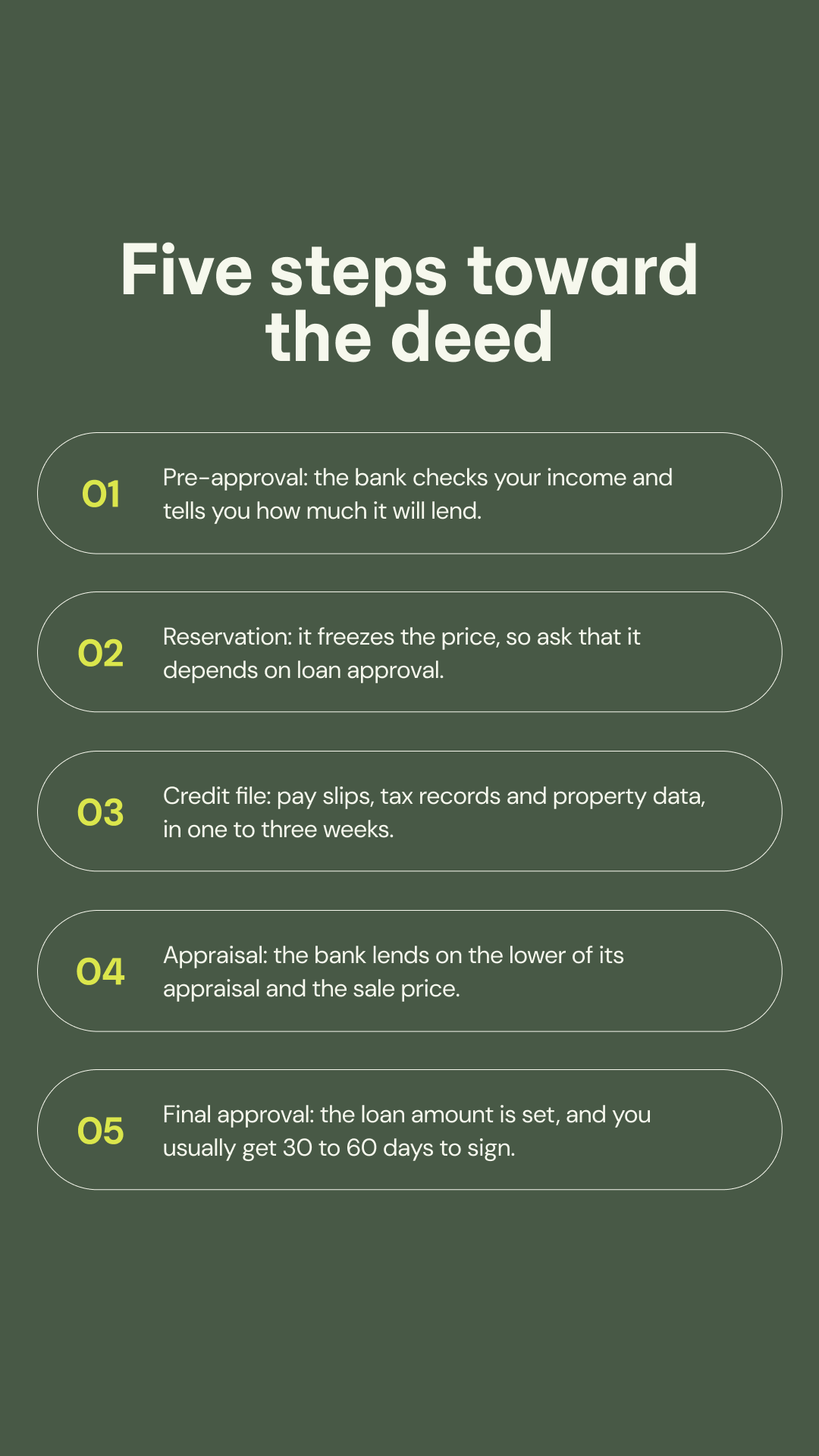
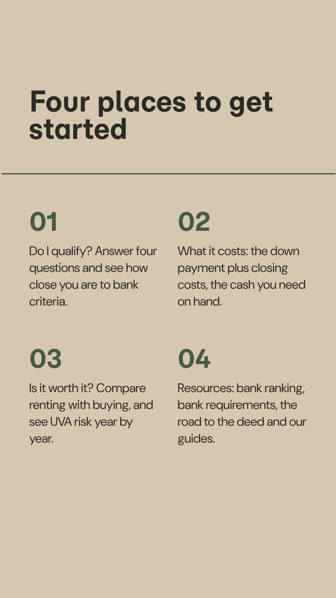
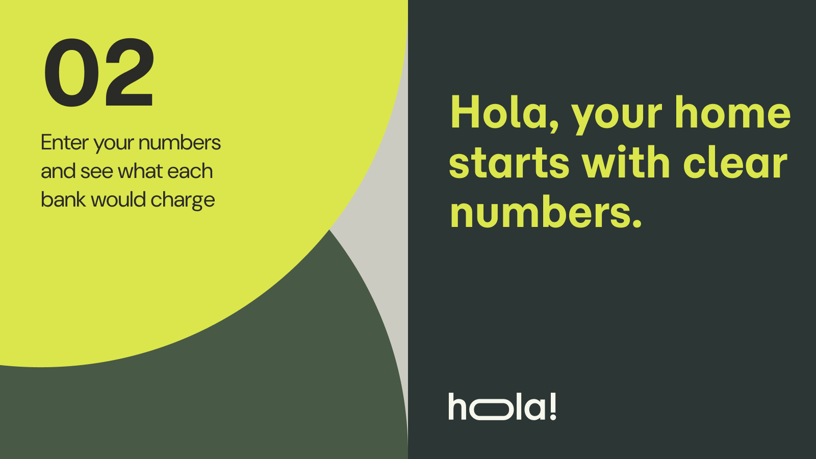
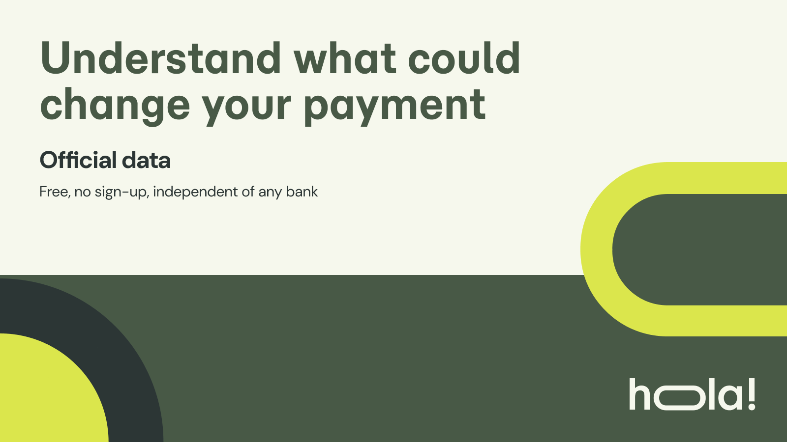
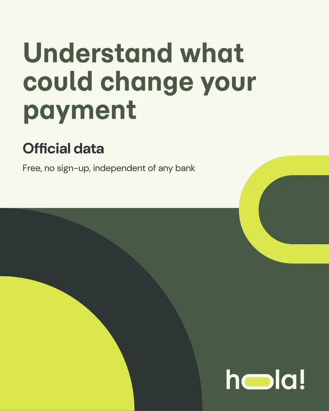
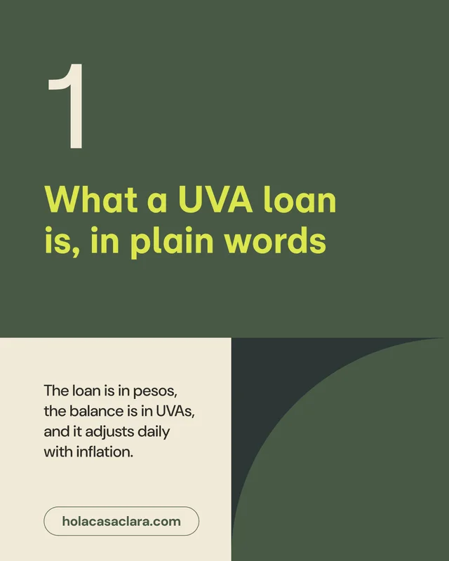
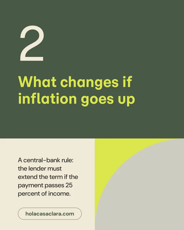
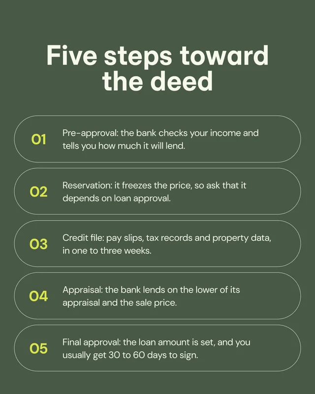
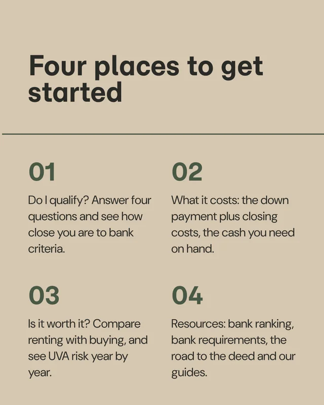
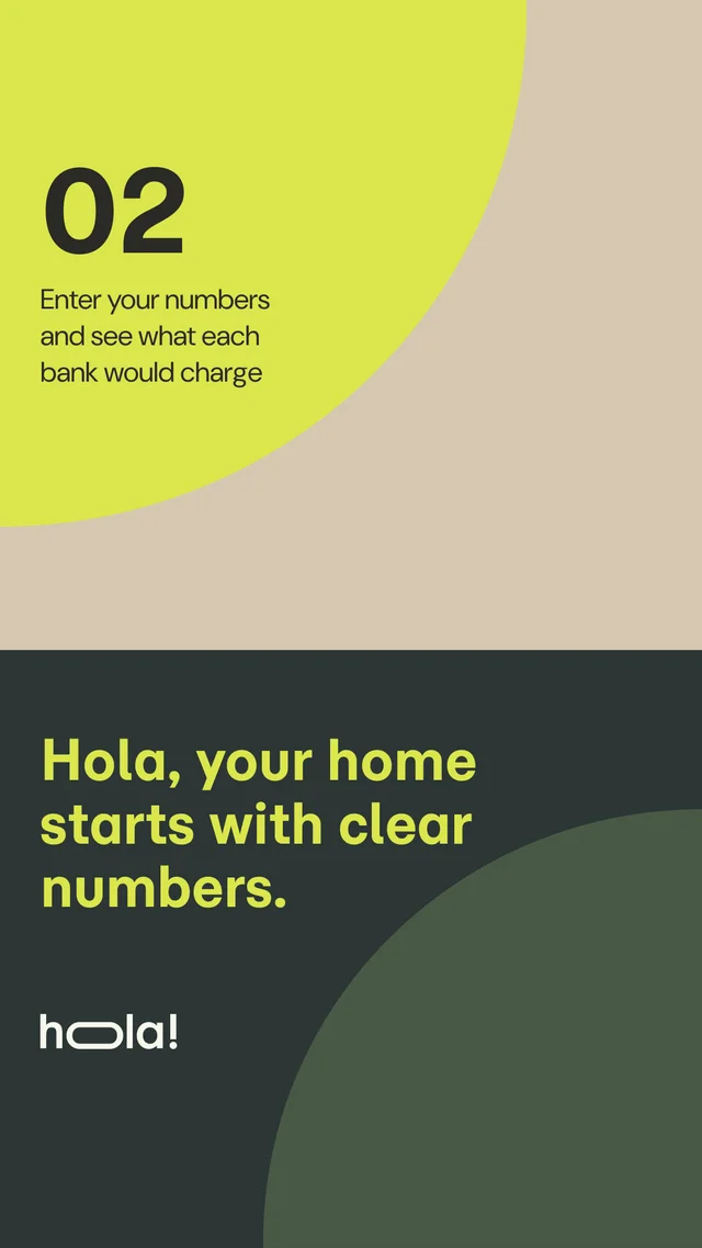
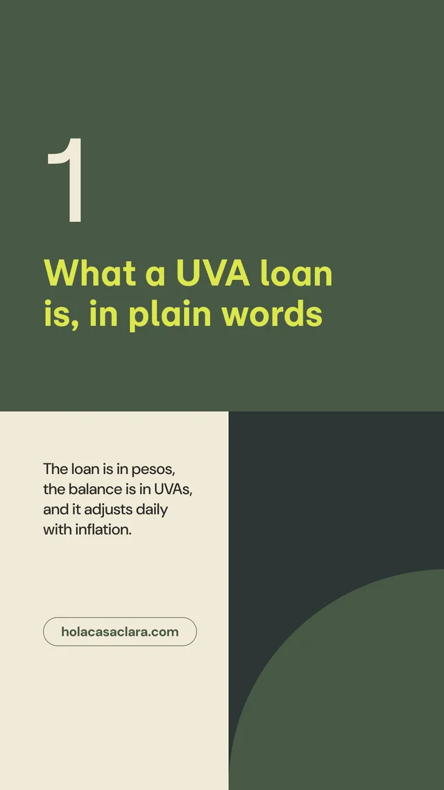
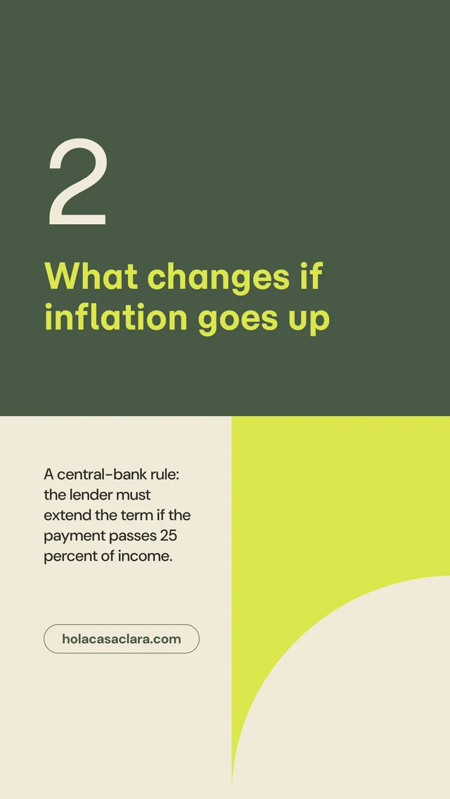
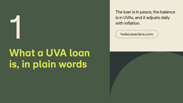
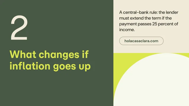
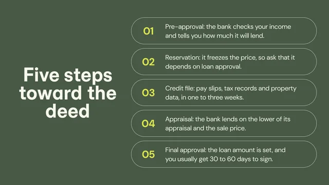
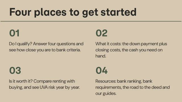
Article, case study, report, presentation, social, and editorial layout structures.






AI and handoff / AI usage
In progress. This page arrives in a later version of the Hola CasaClara style guide.
In progress.
In progress.
In progress.
In progress.
In progress.
In progress.
In progress.
In progress.
In progress.
In progress.
In progress.
In progress.
In progress.
In progress.
In progress.
In progress.
AI and handoff / handoff
In progress. This page arrives in a later version of the Hola CasaClara style guide.
In progress.
In progress.
In progress.
In progress.
In progress.
In progress.